What is Web design and why is it so important to avoid mistakes while designing a website?
Web design is the process of developing and designing websites using various types of skills, it involves planning, conceptualization, and strategy to make the user experience better and ultimately increase the number of visitors. Do you know there are over 1 Billion websites on www (World Wide Web) in January 2023? Since the inception of Word press the rate of creation of websites was increasing day by day, and to compete in this is very difficult.
But most website is not good, there are several web design mistakes on those websites which affect them in many ways, such as bad user experience if your website is difficult to navigate or slow speed, the user will quickly leave your website, and it also affects your SEO score which is very important to rank your website on Search Engine Result Page.
Now the question arises what are these mistakes and how to avoid them? Let’s jump in and study in detail.
Common Web design mistakes and how to avoid them
Bad Navigation or Layout
If a user or crawler is visiting a website, the first thing they want in a website is everything is understandable, its layout or structure, and perfect navigation otherwise the visitor will leave your website and the crawler will never rank that website. To avoid this common web design mistake first you need to categorize and arrange them hierarchically to make navigation more understandable like Menus, contact forms, etc. The second thing you must keep in mind is the layout, you will have to create a responsive web design website so that it can run on any screen size without disturbing the structure and quality of the website.

Hard to Read
If you have blogging websites, services websites, or e-commerce websites, you want your content to be easy to read for the targeted audience, otherwise, it will only make them feel like a waste of time. To avoid this common mistake you can do a few things
- Your Subheadings should be clear as possible so that the user can easily understand the content.
- Use of color on interesting words or paragraphs, to engage users on your website.
- If possible use Sans-Serif fonts, it is the most readable font.
And if you are using Word press then you can use a different page builder like Elementor, or Divi they will provide advanced design settings to improve your website readability, and can easily avoid this web design mistake.
Mistake in images
There are so many people who think that using images everywhere on a website makes it look good. But in today’s world the answer is no, it not only makes it look messy but also heavily impacts the speed of the website.
The solution to avoid this mistake is by using quality images over quantity of images, which are relevant to your website's content. You can reduce the size of the high-quality images by reducing their quality from different online compressing software available. You can use Slider to make it more alive and attractive without placing images everywhere on the website.

Mistake in choosing the colors
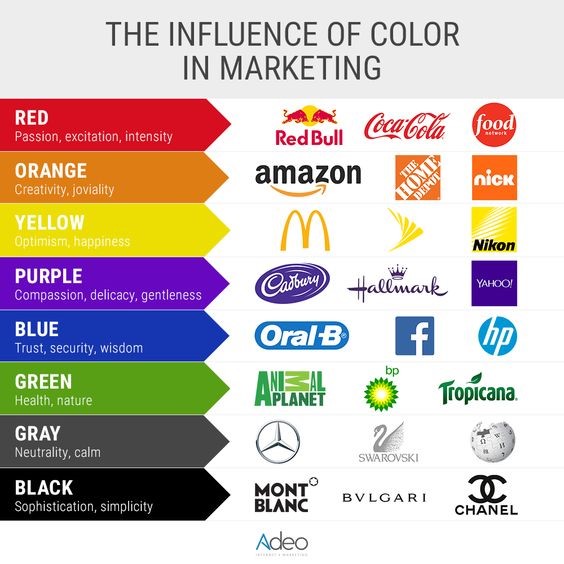
Choosing the wrong Color palette is the most common web design mistakes done by web designers. The different color pattern has a different influence on users. For ex- Blue is the color of faith, belief, etc. So it is important to choose the right combination of colors.
- Always use color according to the trends and don’t use too many colors.
- Check the color, how is it looking on different devices, is it appealing or not.
- Never use too many shades of one color it will only make your website fade.
Unclear Call to Action
One of the most important aspects of the website is CTA, which tells the user to take different-different actions. And if the CTA is not clearly defined or not working properly or faded will definitely decrease user engagement. To avoid this common web design mistake, we should use bold typography and highly contrasting colors.
Always use the clear word to define CTA like Download now, Register here, Submit, etc. Also, put the CTA on that where it is easy to access for users, and don’t use too many CTA in one place it will look overcrowded and put a bad impact on user experience.
Mistake in Optimizing the Website
Every website owner wants their website to rank on the first page of the Search engine result page, but very few people know how to do that by optimizing the website. Some people do optimize their websites but they did not complete every aspect of optimization that’s why they get incomplete results.
To avoid this web design mistake
- Use of proper Title, and heading tags, not long but clearly describing the keywords.
- Url should be 60-70px long only and clear.
- Use different heading tag H1, H2, H3, etc. to show data in a perfect structure.
- Always stay away from plagiarized content, it will critically harm your SEO ranking
- Artificial intelligence content is easy to use but it is also easy to identify it according to different webmaster guidelines.
- Proper use of different Meta tags which is essential for the SEO of the websites like Schema, title, Meta description, robot.txt, etc.
Website Security, password, and backup mistakes
We are living in a world where we have to keep sharing our personal information online for different purposes, the same goes for the users. They will trust those websites that have some type of certificate or are certified by some trustworthy authorities. So it is important to take SSL (Secure Socket Layer) certificate to tell the users that the website is secure like HTTPS.
Second is the password, a website always remains at risk of cyber-attacks, so it is important to have a strong password like the combination of upper-lowercase letters, symbols, and numbers, and must be long.
Third is the backup, somehow whatever the reason if it’s due to some malfunction, hacking, or any other reason the lost data is lost. That’s why always make a backup file or system ready.
Conclusion
In conclusion, web design is a crucial process in developing a successful website that attracts and retains visitors. However, there are common web design mistakes that web designers make, which can negatively impact a website's user experience and SEO ranking. These mistakes include bad navigation and layout, hard to read content, too many or irrelevant images, wrong color palette, unclear call-to-action, incomplete optimization, and security, password, and backup mistakes. To avoid these mistakes, web designers should prioritize usability, readability, and security when creating a website. By avoiding these mistakes, web designers can create websites that attract and retain visitors, improve their SEO ranking, and ultimately achieve their goals.
 How to Turn Your Photos into Ghibli-Style Art with ChatGPT for Free
 Top 10 AI Tools for Plagiarism-Free Content Writing: Boost Your SEO & Digital Marketing Efforts
 The Rise of Graphic Designing in 2025: A Career Guide.
 The Rise of Video Editing: A Crucial Skill in 2025
 Top 10 Digital Marketing trends in 2025
 Common Mistakes in Digital Marketing and How to Avoid Them 2025
 The Future of Digital Advertising: What You Need to Know
 Social Media Marketing in 2024: Strategies for Maximum Engagement
 Building a Successful Digital Marketing Funnel: A Step-by-Step Guide
 5 ways to make money from home using AI (Artificial-Intelligence) in 2024